If this is your first visit, be sure to
check out the FAQ by clicking the
link above. You may have to register
before you can post: click the register link above to proceed. To start viewing messages,
select the forum that you want to visit from the selection below.
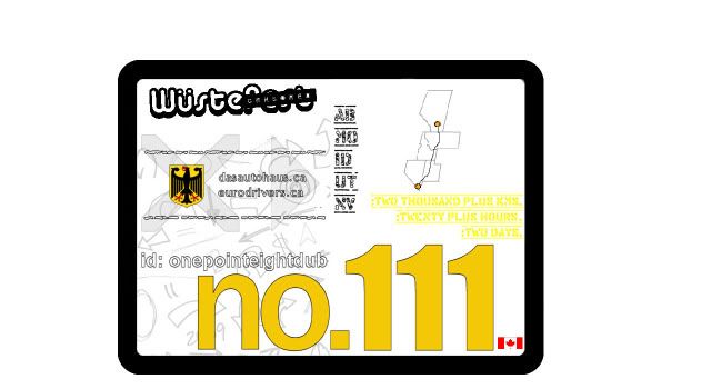
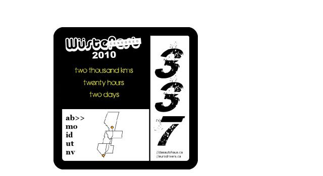
And Jan, I like your second design better but I'd make the arrows/scribbles a little bit lighter and maybe not make the numbers overlap so that you can read them better.
just for you tyler. I like your orange version better than the green too. .
drive green ||
2003 Volkswagen Jetta 1.8T - ex old fun car
2011 Mercedes Benz B200 Turbo - daily getter
tyler's layout is the easiest to work with but if the map idea is doable i can work with it and come up with something. just let me know/more input especially from boss das auto (colors, font, placing of the number/maple leaf left or right, whatever.)
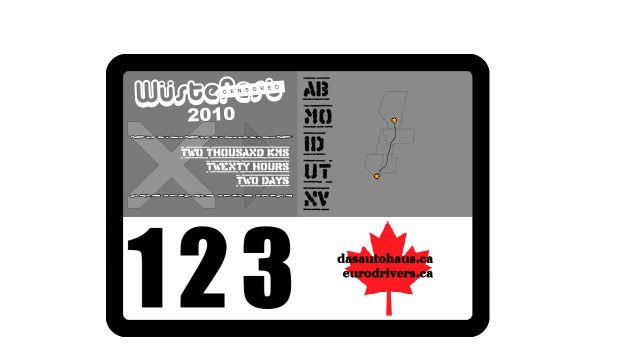
i dont know how much vinyl cutting and printing has advanced in the last 5 years, but when i designed bike sponsor stuff a while back you couldn't do the shading you are trying to do with things like the X and arrow behind the writing. it just doesn't work.
using various grayscales was also a complete bust most of the time.
Team Highschool Twin Turbo Turbo Smurf Avant
www.ctsturbo.com - the home for all your turbo needs. PM me for details.
the only way i see that can be done is if we used 3 shades of gray and cut up the x's and arrow's separately (not cost effective). you would have to cut the font out of the gray to get the white font underneath (complicated). layer the lighter gray with the map (not sure how the map can be done, still complicated). and then stick the black fonts on and maple leaf where they go (easy). lol these were all just for fun anyway. plus the wustefest censored logo is quite tiny that it would be prety difficult to cut.
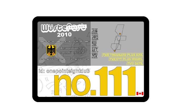
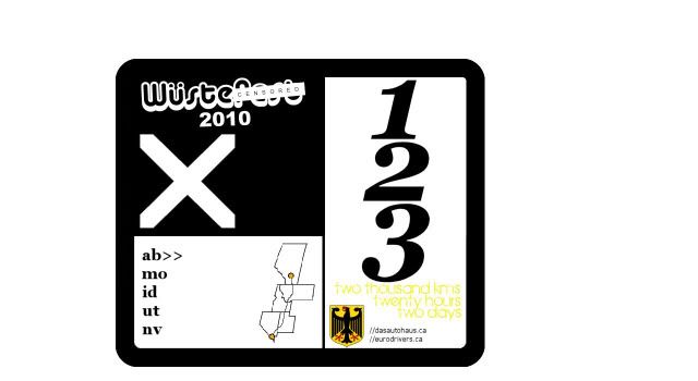
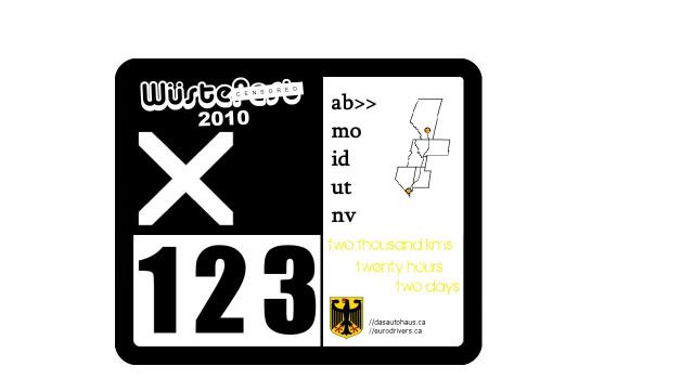
here's black and white and a bit of yellow. i could switch the number vertically to the right and move the map to the left instead as well. i love photoshop.
the only way i see that can be done is if we used 3 shades of gray and cut up the x's and arrow's separately (not cost effective). you would have to cut the font out of the gray to get the white font underneath (complicated). layer the lighter gray with the map (not sure how the map can be done, still complicated). and then stick the black fonts on and maple leaf where they go (easy). lol these were all just for fun anyway. plus the wustefest censored logo is quite tiny that it would be prety difficult to cut.
here's black and white and a bit of yellow. i could switch the number vertically to the right and move the map to the left instead as well. i love photoshop.
i gotta ask, whats with the enormous X?
Team Highschool Twin Turbo Turbo Smurf Avant
www.ctsturbo.com - the home for all your turbo needs. PM me for details.
 Tweet
Tweet

 .
.


Comment